 Today's post is a continuation of yesterday's.
Hi Christine,
I built this house and just moved in in June. I think some of my choices have been good so now I'm terrified to ruin it with the decor!! Several concerns but the main one is the great room. The view out the sliders is awesome. It's a protected marsh with tons of wildlife activity and changing vegetation so I didn't want to put furniture in front of the sliders...The problem is I also have the fireplace focal point and the tv wall. Maybe the sectional should have been a sofa? (your sectional is good.) I like the style with nailheads, etc. but what do ya think? I think I still have 30 days to decide...
 The rug will go. I was thinking of perhaps a huge round braided rug?? Very very open concept, so do another of the same in the dining??
There is another weird wall between the kitchen and dining room. I'm returning the painting you see there because I think it's too pizazzy and orange for my taste but I could be talked into it. Your thoughts?? Maybe a photo wall template there? The ficus is pathetic I know.. may come back but not sure!!

For the windows I was thinking woven wood for the back dining room, and possibly off white shutters on just the bottom half in the breakfast. Notice the stained glass panels in the top half... Then my question is, should the two angled windows in the kitchen be the same as the breakfast nook or woven wood like the dining? For the sliders do you think just curtain panels? A woman from Budget Blinds came today and left a few samples see attached. Oh yeah, does the foyer window need to match the sliders? Roman shade there?
Hope this isn't way too much to take in. I'd love any tidbit of advice on any of these questions that you choose!!
Thanks,
Kathy
Kathy
Hi Kathy,
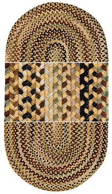
I'd like to start with your rug. First of all, I want to say that I love the idea of the braided rug, and I love Capel. They are a great manufacturer. With that said, I don't like the mostly red with your leather color. I didn't include all of the fabric samples that you included- but I will say that I didn't really like them either... (hopefully I am not telling you this after you already had drapes made...) Your view is amazing!!! (the picture above is her view!!!). I would keep my interior colors pretty neutral- and play up the color of your view. I also thought your fabrics that were shiny were all wrong. I would stay with the feel you have going now- which is very nice- more casual. I also thought that a square or rectangle rug would be better than the oval. (most of their colors come both ways.) The rug I selected for you is below- from Capel- in a square.

Should you have all the same rug throughout? Most of the time I say- absolutely not- but with braided rugs- you could if you want to- but still don't have to. The rug I selected for you below is also from Capel. You could do something like this in your entry or dining area. You want consistency in style- as in casual- not formal----- BUT- you want it different in style- as in don't have multiple braided rugs that are all different colors... So- does that make sense? The same style- but different styles. I am sure that is coming off perfectly clear.

For your drapes- I suggest panels- Check out the plaid below from Lee Jofa. I think it is beautiful. See how subtle I am creating the color pallet?
 I am not a fan of the leather ottoman right by the leather sectional. I would re-upholster- just the top of it. I know that leather is very practical- but textural variety is more important. :) This black fabric below from Robert Allen is my suggestion for the top of the ottoman. It would not have a stark contrast with the sides- and brings in the browns. The plaid above brings in some black- so we are all tying together here.
 I selected a new floor lamp for you- Uttermost- there is more texture needed in your room. Your room is too smooth.
Good call returning the art- it is a cool piece- but I wouldn't select it for your place. Below I have a few wall decor ideas for you- from Uttermost.

Overall you have a great look going- work with it- not against it. Remember that your focal point is your view. Your other items should add interest and texture- but not try to compete with the view.
Thanks,
Christine


0 comments:
Post a Comment